Introduction
Credit-Card fraud: the scale of the problem
From 2011 to 2012, the total losses on UK cards (debit + credit) increased to £185 million in the first half of 2012, a 9% rise compared with the last six months of 2011 (source: UK Cards Association).
Although this is below the peak of £304 million in losses in the first half of 2008, criminals are increasingly resorting to traditional ways of stealing people’s details to combat anti-fraud advances such as chip and PIN.
And the situation has only worsened in recent years. Indeed from 2017 to 2018 unauthorised financial fraud losses across payment cards, remote banking and cheques totalled £844.8 million in 2018, an increase of 16% compared to 2017. In addition, in 2018 finance industry members reported 84,624 incidents of authorised push payment scams with gross losses of £354.3 million.
With push-payment scams, victims are manipulated into making real-time payments to fraudsters, usually by social engineering attacks involving impersonation. As of 2019, in the UK, because the victims actually authorized the payments, albeit mistakenly, they are typically not fully reimbursed by their banks.
Credit-Card fraud: the bank’s responsibilities
Financial institutions (including banks, insurance brokers, investment companies, etc.) are obliged to guarantee the highest level of security and protection against (an increasing) range of methods criminals use to commit financial crime.
The UK Payment Services Regulations, for debit cards, state that the most you should have to pay is the first £35 of an unauthorised transaction if the bank has reason to believe you should’ve been aware that your payment details were lost or stolen. Your bank can only refuse to refund you if it has evidence that you acted fraudulently, or with ‘gross negligence’. If a fraud occurs on your credit card or a credit facility, the UK Consumer Credit Act takes precedence.
Thus, any accusation of ‘gross negligence’ on the part of the consumer doesn’t arise in this act unless your card provider can demonstrate that you authorised the payment. Consequently it stands to reason that banks and financial institutions are especially interested in preventing bank fraud!
Dynamism of Fraud
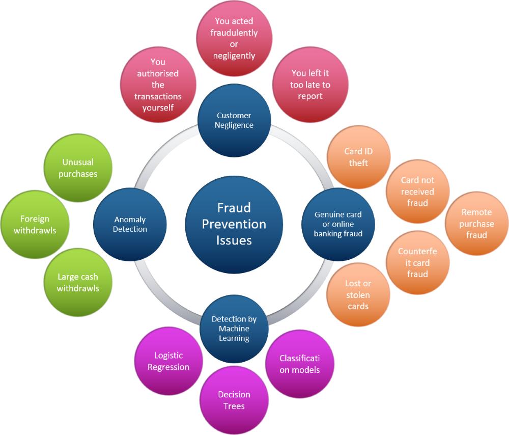
Machine learning and credit card fraud - Issues to consider
Type of fraud
- Triangulation Fraud
- Cramming/Salami Attack
- Behavioural Fraud
- Bankruptcy Fraud
- Application Fraud
- Theft Fraud/Counterfeit Fraud
Data science process
- Data acquisition
- Data cleaning
- Exploratory data analysis
- Data preprocessing
- Application of Machine Learning algorithm(s)
- Review and repeat
Exploratory Data Analysis
Data sources
For this work I’ve used a dataset that is publicly available at OpenML as part of the work of Andrea Dal Pozzolo. As stated on that website, the dataset contains transactions made by credit cards in September 2013 by European cardholders. The dataset presents transactions that occurred over two days, where 492 frauds occurred out of 284,807 transactions. The dataset is highly unbalanced, the positive class (frauds) account for 0.172% of all transactions. And finally, the dataset formed the basis of the work published in Pozzolo et. al., Calibrating Probability with Undersampling for Unbalanced Classification. In Symposium on Computational Intelligence and Data Mining (CIDM), IEEE, 2015.
The data contains only numerical input variables which are the result of a PCA transformation. And we note that unfortunately, due to confidentiality issues, the dataset cannot provide the original features nor any further background information.
The only features which have not been transformed with PCA are ‘Time’ and ‘Amount’.
- Feature ‘Time’ contains the seconds elapsed between each transaction and the first transaction in the dataset.
- Feature ‘Amount’ is the transaction amount, this feature can be used for example-dependant cost-senstive learning.
- Feature ‘Class’ is the response variable, which takes value 1 in case of fraud and 0 otherwise.
The dataset has been collected and analysed during a research collaboration of Worldline and the Machine Learning Group (mlg.ulb.ac.be) of ULB (Université Libre de Bruxelles) on big data mining and fraud detection.
Note that the study conducted here is based on the work of Lukas Frei, which is available in this article. In the version that follows I add further commentary to the exploratory data analysis that is performed. Then, in a later article, I will update some of the machine learning routines and their parameters to ensure they remain resilient to possible future changes in algorithms within the SciPy stack. Finally, in that later article, I will include a more detailed discussion into how to deal with highly imbalanced datasets, as we have here. Links to the machine learning article, to come later, will be provided here when it is ready for publication.
Imports and Styling
Here I import the standard Python data science libraries necessary for data analysis, data visualization, and machine learning work - you may often see them referred to as the SciPy stack. Since I completed this work within a Jupyter Notebook, you’ll notice the use of %matplotlib inline magic function. This command should be viewed much like an OS command-line call, which in this case means the output of any plotting command is displayed immediately inline within the Notebook frontend. That is, directly below the code cell that produced it. See Jupyter documentation for more.
%matplotlib inline
import scipy as sci_version
import matplotlib as matplotlib_version

import scipy.stats as stats
import numpy as np
import pandas as pd
import matplotlib.pyplot as plt
import seaborn as sns
sns.set()
Load data
Read the data in, from a CSV file, and store it in a Pandas DataFrame. The DataFrame created will take on the column names provided in the file.
df = pd.read_csv('creditcard_data.csv')Number of rows and columns
Lets start right at the basics and ask the question what does our dataset look like? To answer we obtain a tuple that represents the dimensionality of the DataFrame - notice how rows are represented in the first element of the df.shape tuple, and columns in the second element.
print('This data frame has {} rows and {} columns.'.format(df.shape[0], df.shape[1]))
This data frame has 284807 rows and 31 columns.
DataFrame columns summary
Now, lets print a concise summary of the DataFrame - that is, info() will print information about the DataFrame including the index and columns data types (dtype), non-null values and memory usage.
df.info()View a random sample of data
Return a random sample of items from an axis of the object. The axis you choose defaults to ‘None’, which fallsback to the data type (0 for Series and DataFrames, 1 for Panels). Thus, since we’re dealing with a DataFrame here the fallback will be axis ‘0’, which will be a random sampling of rows (recall, as pointed out just above, an index of 0 i.e. the first element, means rows).
df.sample(5)DataFrame Descriptive Statistics
Generate descriptive statistics that summarize the DataFrame, excluding NaN values.
The describe() method analyzes both numeric and object series, as well as DataFrame column sets of mixed data types. Of course we know from df.info above that the data types are all numeric - so we should expect a standard Tukey five-number summary plus dispersion, central tendency and count.
Note: I exclude the column labelled Class (np.int64) since this is either 0 (for not fraudulent) or 1 (fraudulent).
df.describe(exclude=[np.int64])Transaction Amount and Time Descriptive Statistics
To focus on the transaction time and amount it is firstly appropriate to fix the number of decimal places that will be displayed. Thus, option_context allows you to set the display value of the specified option - specifically within the context of the with block only. We set the numerical precision in this case.
It is possible that the shorthand precision command may break if new option(s) with similar name(s) are added in future versions of pandas. Hence we add the try except block here to warn us if this should ever become an issue.
Finally, again within the with block, we print out all rows (hence the colon) for column labels Time and Amount only (i.e. non-anonymized columns). Then we run describe() on these columns. Time is the number of seconds elapsed between a particular transaction and the first transaction in the dataset. Amount is transaction amount.
try:
    # Change the display of numbers to 3 decimal places.
    # The display will reset to the default of 6 decimal places
    # at the end of the 'with' block.
    with pd.option_context('precision', 3):
        print(df.loc[:, ['Time', 'Amount']].describe())

except KeyError as e:
    print(e)
Counts of Fraudulent versus non-Fraudulent Transactions
Using df.Class effectively extracts the column labelled Class as a pandas Series object. So then the value_counts() method will return another pandas Series object containing the counts of unique values. It will have as many elements as there are unique values, so you should expect there there to be only two types of element, one for fraudulent (of value 1) and one for non-fraudulent (of value 0). You can see this below with len(counts), which should equal 2.
Next, variable counts holds the unique values (0 and 1) in descending order of most frequently-occurring element. And you’d likely expect the most frequently occurring element to be the non-fraudulent class (again, of value 0), though of course there is no guarantee this will be the case.
counts = df.Class.value_counts()
if (len(counts) != 2):
    print("THAT'S ODD - THERE ARE MORE THAN TWO CLASSES")

if (counts.index[0] == 0):
    # The most frequently occurring Class is 0 i.e. non-fraudulent.
    non_fraud_count = counts[0]
    fraud_count = counts[1]
else:
    # The most frequently occurring Class is 1 i.e. fraudulent.
    fraud_count = counts[0]
    non_fraud_count = counts[1]

if (df.shape[0] != (non_fraud_count+fraud_count)):
    print("WARNING: SUM OF FRAUDULENT AND NON-FRAUDULENT COUNTS DOES NOT EQUAL SHAPE OF DATA")

pc_normal = (non_fraud_count/(non_fraud_count+fraud_count))*100
pc_fraudulent = (fraud_count/(non_fraud_count+fraud_count))*100
print('There were {} non-fraudulent transactions ({:.2f}%) and {} fraudulent transactions ({:.2f}%).'.format(non_fraud_count, pc_normal, fraud_count, pc_fraudulent))
There were 284315 non-fraudulent transactions (99.83%) and 492 fraudulent transactions (0.17%).
And thus we see the scale of the imbalance between fraudulent and non-fraudulent transactions - and hence the challenge that lies ahead when we come to perform our machine learning analysis. But for now, onwards with the background data exploration!
Visual Data Exploration
Distribution of Transaction Time
Since our independent variable is time, and we wish to take a look at the distribution of time as the dependent variable, a kernal density plot overlaying a histogram is the most appropriate first glance at our data. We have a univariate distribution of observations: a kernel density estimate and histogram with bin size determined automatically with a reference rule (the default following the Freedman-Diaconis rule).
We note that this distribution plot shows a bimodal distribution and thus although several summary statistics have been suggested to describe such distributions, there is presently no generally agreed set of statistics that can properly quantify the parameters of a general bimodal distribution.
A conclusion might simply be to note how the maximum time value 172792 (the number of seconds between this final transaction and the first) is equivalent to roughly 48 hrs.
- Thus the data set appears to be transactions that occurred over a two day period - and thus the bimodal nature of the distribution represents a day-night cycle of activity.
- One could argue that transactions in the middle of the night, or in the early morning are not in line with normal behaviour - but without a longer timeframe to study it perhaps isn’t so straightforward to draw such a conclusion.
- Besides, it is also possible that online retailers and online transaction processing is automatically staggered to occur throughout the night (or indeed 24 hrs a day 7 days a week) for the most efficient use of their server time. This could be used to explain the continued credit card activity through the night.
plt.figure(figsize=(15, 10))
plt.title('Distribution of Transaction Time')

plt.ticklabel_format(axis='y', style='sci', scilimits=(0,0))

# Univariate distribution of observations.
ax = sns.distplot(df.Time,
                  kde_kws={"linewidth": 1.5, "alpha": 1, "color": "k", "label": "KDE"},
                  axlabel='Time'+'\n'+'(seconds between current transaction and first transaction)')
ax.set_ylabel("Probability Density Function")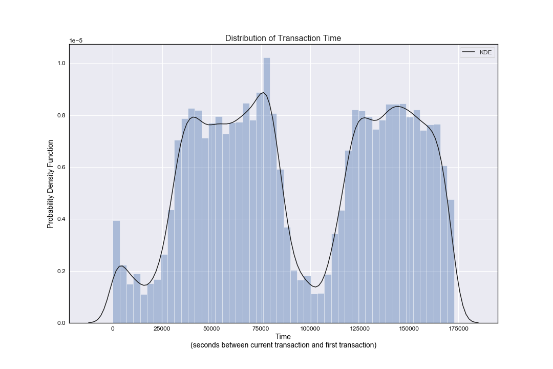
Distribution of Transaction Amount
Once again, we have a univariate distribution of observations: a kernel density estimate and histogram with bin size determined automatically with a reference rule (the default following the Freedman-Diaconis rule).
As noted above when first describing transaction amount and time descriptive statistics - out of all credit card transactions:
- The mean was shown to be ~88 USD - set against a median of ~22 USD.
- The standard deviation was shown to be ~250 USD.
- The maximum transaction was shown to be ~25,691 USD.
- As a rule of thumb we would normally state that the mean is to the right of the median when the distribution is right skewed, and to the left of the median when the distribution has left skew. This, alongside a visual inspection of the below figure, clearly shows the distribution of transaction amount has a positive skew, i.e. it is right-skewed.
plt.figure(figsize=(15, 10))
plt.title('Distribution of Transaction Amount')

plt.ticklabel_format(axis='y', style='sci', scilimits=(0,0))

# Univariate distribution of observations.
ax = sns.distplot(df.Amount,
                  kde_kws={"linewidth": 1.5, "alpha": 1, "color": "k", "label": "KDE"},
                  axlabel='Transaction Amount')
ax.set_ylabel("Probability Density Function")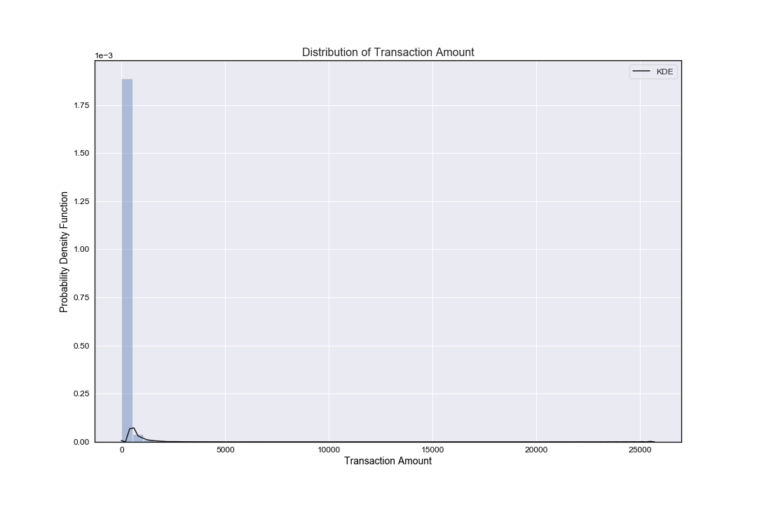
Skewness
As an example, compare the skewness of Transaction Time and Amount to their respective distribution plots (distribution of transaction time and distribution of transaction amount):
- The distribution plot of transaction amount showed a highly positive (right) skew … and we see that numerically in the results below (skew 16.978).
- The distribution plot of transaction time showed a more complex bimodal distribution and thus although several summary statistics have been suggested to describe such distributions, there is no presently generally agreed set of statistics that can properly quantify the parameters of a general bimodal distribution.
Other examples to note include variables V8 and V28, both of which show a fair amount of skew. However, since the dataset has been anonymised is difficult to draw further conclusions from this.
# Return unbiased skew over requested axis Normalized by N-1.
# We use 'axis=0' here, meaning across column labels.
the_skew = df.skew(axis=0)
the_skew
Plot of Fraudulent versus non-fraudulent transactions
plt.figure(figsize=(15,10))
sns.barplot(x=counts.index, y=counts)

plt.title('Count of Fraudulent versus Non-Fraudulent Transactions')
plt.ylabel('Count')
plt.xlabel('Class (0:Non-Fraudulent, 1:Fraudulent)')
plt.savefig('fraud_v_nonfraud.png')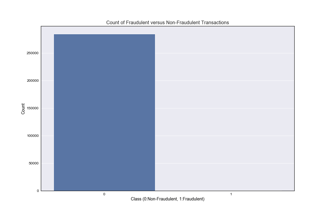
Pearson Correlation of DataFrame Columns
Compute the pairwise correlation of columns, excluding NA/null values. The correlation method defaults to Pearson (i.e. it will calculate the standard pairwise Pearson correlation coefficient), with a minimum number of observations required per pair of columns being 1 in order to have a valid result.
corr = df.corr()and also consider producing a heatmap:
corr = df.corr()
mask = np.zeros_like(corr)
mask[np.triu_indices_from(mask)] = True

plt.figure(figsize=(15,15))

with sns.axes_style("dark"):
    ax = sns.heatmap(data=corr, mask=mask, square=True)

plt.title('Heatmap of Pearson Correlation')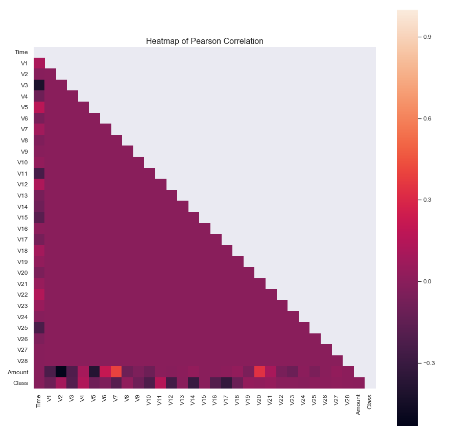
- The heatmap of the correlation coefficient, and the table of data that accompanies it (not shown here for brevity), suggests some non-negligible correlation between variable V7 and Amount, as well as variable V20 and Amount.
- Performing a pairplot of those variables should give us a further indication of the source of these correlations.
corr = df.corr()

plt.figure(figsize=(10,10))

ax = sns.pairplot(data=corr, vars=["V7", "V20", "Amount"], diag_kind="hist", height=5)

ax.fig.suptitle('Pairplot of V7, V20 and Transaction Amount', y=1.025, fontsize=18)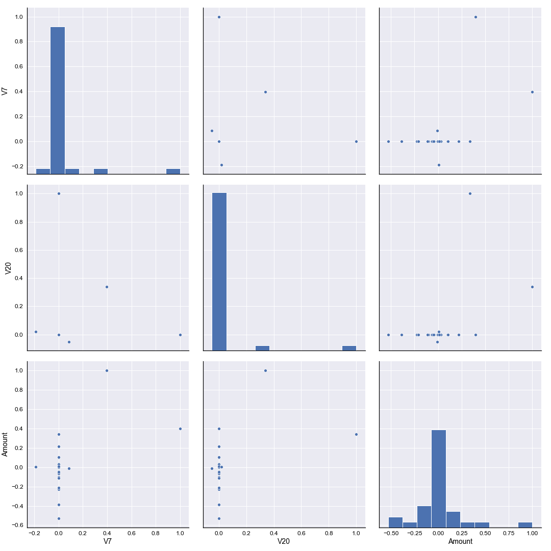
Sure enough we see that for both variable V7 and V20 the correlation against the Amount variable occurs at values of V7 and V20 equal to zero. Again, since the data set has been anonymised it’s difficult to draw any further conclusions based on this. It may well be, for example, that the two outliers in both V7 and V20 are fraudulent transactions, given that the correlation has been heavily influenced by values typically around zero. We simply have no further evidence to take such a theory any further.
Conclusions
See there we have it - a general exploration of the structure and statistical makeup of our dataset. The biggest conclusion we can draw is to realise just how imbalanced the data is between fraudulent and non-fraudulent transactions, which in turn will direct us when it comes to our machine learning study. The link for that article will be included here when it is published (coming soon!).
